WIDE American Gothic Farmers with Young Wives farmercowboy.com 1.jpg
American Gothic: The 12 Rejected Versions Censors Didn’t Want You to See
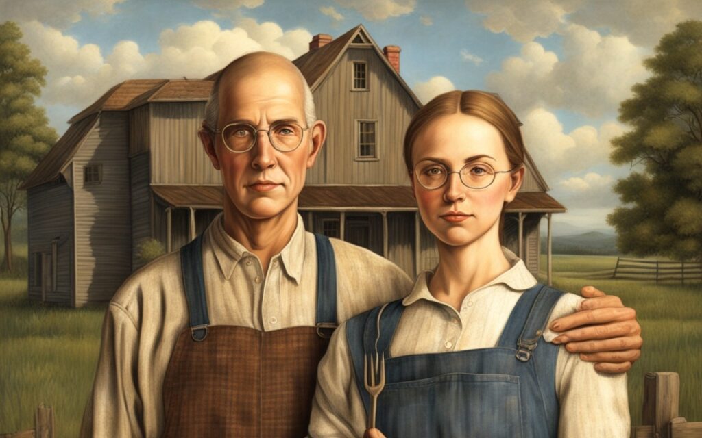
Cedar Rapids, Iowa — We all recognize Grant Wood’s iconic painting, American Gothic—a stern-looking farmer standing beside a woman (who is often mistaken as his wife but is actually his sister), holding a pitchfork in front of their simple, white farmhouse. It’s an image that has come to symbolize the hardworking, no-nonsense spirit of rural America. But what many people don’t know is that this famous painting wasn’t Wood’s first attempt at capturing the essence of rural life. In fact, Wood created 12 different versions of American Gothic, each one rejected by the censors for reasons that range from the laughable to the downright absurd.
The Glamorous Young Wife
Perhaps the most controversial of Wood’s rejected paintings featured a younger, glamorous wife beside the farmer. This version raised eyebrows among the censors, who claimed it would send the wrong message about age-appropriate marriages. The sight of a 45-year-old farmer standing beside a 20-year-old, blonde beauty dressed to the nines was too much for them to handle. The censors were concerned that viewers might see the farmer as a gold-digger or, worse, that the painting would undermine the traditional values they sought to uphold. Wood was told to go back to the drawing board, where he eventually replaced the young wife with his own sister, who was closer to the farmer’s age and dressed in more modest attire.

Wardrobe Woes
The farmer’s iconic overalls were another point of contention. Censors worried that overalls were too informal and didn’t convey the dignity they wanted to portray. In one rejected version, the farmer was dressed in a tuxedo, while the woman beside him wore a Victorian gown. This attempt to elevate the farmer’s status fell flat, as the censors realized that formalwear didn’t exactly scream “farm life.” Wood tried various outfits before settling back on the overalls, which he argued were not only appropriate but essential to the painting’s authenticity.
Background Backlash
Even the background of American Gothic was subject to scrutiny. In one version, Wood experimented with replacing the farmhouse with a big city skyline, as a way to contrast the rural and urban worlds. However, the censors thought this was too confusing and worried that it might lead to misinterpretations of the painting’s message. They wanted a clear representation of rural America, so Wood was forced to revert to the more traditional farmhouse setting. Another rejected version featured a shiny new tractor in the background, which was deemed too modern. The censors believed that the farmer should stick to a horse and plow to maintain the painting’s nostalgic tone.
Overly Cheerful Chickens and Judgmental Cats
It wasn’t just the humans in American Gothic who were subject to censorship; even the animals didn’t escape unscathed. In one version, Wood included a barn cat sitting on the fence, staring directly at the viewer with a piercing gaze. The censors thought the cat’s expression was too judgmental, arguing that it might unsettle viewers. The cat was quickly removed, leaving the farmer and his sister alone in their solemnity.
Another rejected version included a group of overly cheerful chickens clucking around the yard. The censors were worried that the chickens’ happiness clashed with the serious tone of the painting. They instructed Wood to paint the chickens with a more subdued demeanor, or better yet, remove them altogether. In the end, Wood decided to keep the focus on the farmer and his sister, leaving the animals out of the final version.
The Farmer’s Smile
In one of the more lighthearted rejected versions, the farmer was depicted with a wide smile on his face. This, of course, was a problem. The censors claimed that a smiling farmer looked untrustworthy, as if he was hiding something. They believed that the farmer should appear serious and stoic, embodying the hardships and perseverance of rural life. Wood begrudgingly erased the smile, returning the farmer to his stern, unsmiling expression.
The Beard Debacle
Facial hair was another issue that the censors took seriously. In one version of the painting, Wood gave the farmer a full beard, thinking it added to his rugged, hardworking appearance. But the censors disagreed. They thought the beard made the farmer look too much like a lumberjack or a mountain man, which didn’t align with the image of a respectable landowner they wanted to convey. Wood was asked to remove the beard, which he did, reluctantly restoring the farmer to his clean-shaven state.
The Barn Door Debate
Details matter, and nowhere was this more evident than in the debate over the barn door. In one of Wood’s rejected paintings, the barn door was left slightly ajar, revealing a cluttered interior filled with tools and hay. The censors were not pleased. They argued that the open door made the farm look messy and disorganized, not the neat, orderly farmstead they envisioned. Wood was instructed to close the barn door and keep the focus on the exterior of the farmhouse, which he eventually did in the final version.
The Modern Wife
In one particularly daring version of American Gothic, Wood painted the farmer’s wife in a flapper dress, complete with bobbed hair and a cigarette in hand. This depiction of a modern woman was far too progressive for the censors, who feared it would send the wrong message about women’s roles on the farm. They insisted that the wife should be dressed more conservatively, in a way that reflected traditional values and gender roles. Wood conceded, and the flapper wife was replaced with a more demure figure, in line with the censors’ expectations.
Too Much Corn
Even the crops in American Gothic were subject to scrutiny. In one version, the cornfields in the background were depicted as tall and lush, representing a bountiful harvest. But the censors were concerned that the prosperity of the crops might give viewers the wrong impression about the hardships of farm life. They suggested that the corn be scaled back, made to look more sparse and struggling. Wood, frustrated by the constant demands, reluctantly toned down the corn, making the fields look less abundant and more reflective of the challenges faced by farmers.
The Dog Distraction
In one of the more whimsical rejected versions, Wood included a loyal dog sitting at the farmer’s feet, looking up at him with adoration. While this addition was meant to add warmth to the painting, the censors thought it was too cute and would distract viewers from the seriousness of the farmer’s expression. They argued that the dog made the scene too domesticated, and that it undermined the painting’s focus on the hardships of rural life. The dog was removed, leaving the farmer and his sister to stand alone in their stoic pose.
The Missing Pitchfork
Finally, in the last rejected version of American Gothic, Wood was asked to remove the pitchfork entirely and replace it with a Bible. The censors argued that the Bible was a more appropriate symbol, reflecting the religious values of the time. But Wood vehemently disagreed. He believed that the pitchfork was a powerful symbol of the farmer’s labor and dedication to the land. Without it, the painting lost its essence. In the end, Wood stood his ground, and the pitchfork remained, becoming one of the most recognizable elements of the painting.
The Pitchfork Controversy
One of the earliest versions of American Gothic featured a pitchfork that was deemed too threatening by the censors. They worried that it might be interpreted as a symbol of aggression, or worse, a weapon. The suggestion was made to replace the pitchfork with a garden hoe, something less pointy and menacing. However, Wood resisted, arguing that the pitchfork was central to the image—it represented the grit and determination of the American farmer. But in another version, the pitchfork was replaced by a bouquet of flowers, which was rejected because it made the farmer look like he was heading to a date, not a day of hard labor.
The Censorship Legacy
Grant Wood’s American Gothic has become an iconic image, celebrated for its depiction of rural life and the American spirit. But the journey to its final form was anything but straightforward. The 12 rejected versions of the painting reveal the challenges artists face when navigating the expectations and demands of censorship. Each rejection, from the cheerful chickens to the overly lush corn, reflects the tension between artistic expression and societal norms.
Wood’s persistence in the face of these rejections is a testament to his commitment to his vision. While we may never see the versions of American Gothic that the censors rejected, their existence adds a layer of complexity to our understanding of this iconic work. It’s a reminder that art is often shaped as much by what is left out as by what is included, and that sometimes, the most interesting stories are the ones that never make it to the canvas.
So the next time you look at American Gothic, take a moment to imagine the farmer smiling, the wife in a flapper dress, or a barn cat with a judgmental gaze. These rejected elements may not have made it into the final painting, but they’re an essential part of the story—one that continues to entertain and provoke thought nearly a century later.
Originally Published at FarmerCowboy.com
2024-08-14 09:36:16
Karl Hoffman is a distinguished agriculturalist with over four decades of experience in sustainable farming practices. He holds a Ph.D. in Agronomy from Cornell University and has made significant contributions as a professor at Iowa State University. Hoffman’s groundbreaking research on integrated pest management and soil health has revolutionized modern agriculture. As a respected farm journalist, his column “Field Notes with Karl Hoffman” and his blog “The Modern Farmer” provide insightful, practical advice to a global audience. Hoffman’s work with the USDA and the United Nations FAO has enhanced food security worldwide. His awards include the USDA’s Distinguished Service Award and the World Food Prize, reflecting his profound impact on agriculture and sustainability.

Internet trolls wouldn’t know a good song if it planted itself in their front yard. Farm.FM, though? They know where the real country lives.